Digital Signage UX
Client
Digital Signage Company
Year
2023
Category
UX Research, User Research, User Interviews, Workshops
Background
We were commissioned by the client to improve the user experience of the digital control panel of their flagship product.
We started by conducting a workshop together with some stakeholders from the client. On their side, there was a mix of marketing personnel and developers. The goal of the workshop was for us to understand where their product stands, understand the clients needs, and ensure that we had alignment for the project.
Homework
The first step of the process was to have our client fill in an assignment we set up in a Miro board. A sample of the questions we asked them to answer were:
What are the 5 most important functions of your service?
Which products/features are most important for customers that you develop within 12–24 months?
Which products/features are most important for customers that you develop within 3-5 years?
The purpose of this assignment was to gain a better understanding of how the client views their product/service in order for us to be able to tailor a workshop that would help them achieve their goals.
Workshop
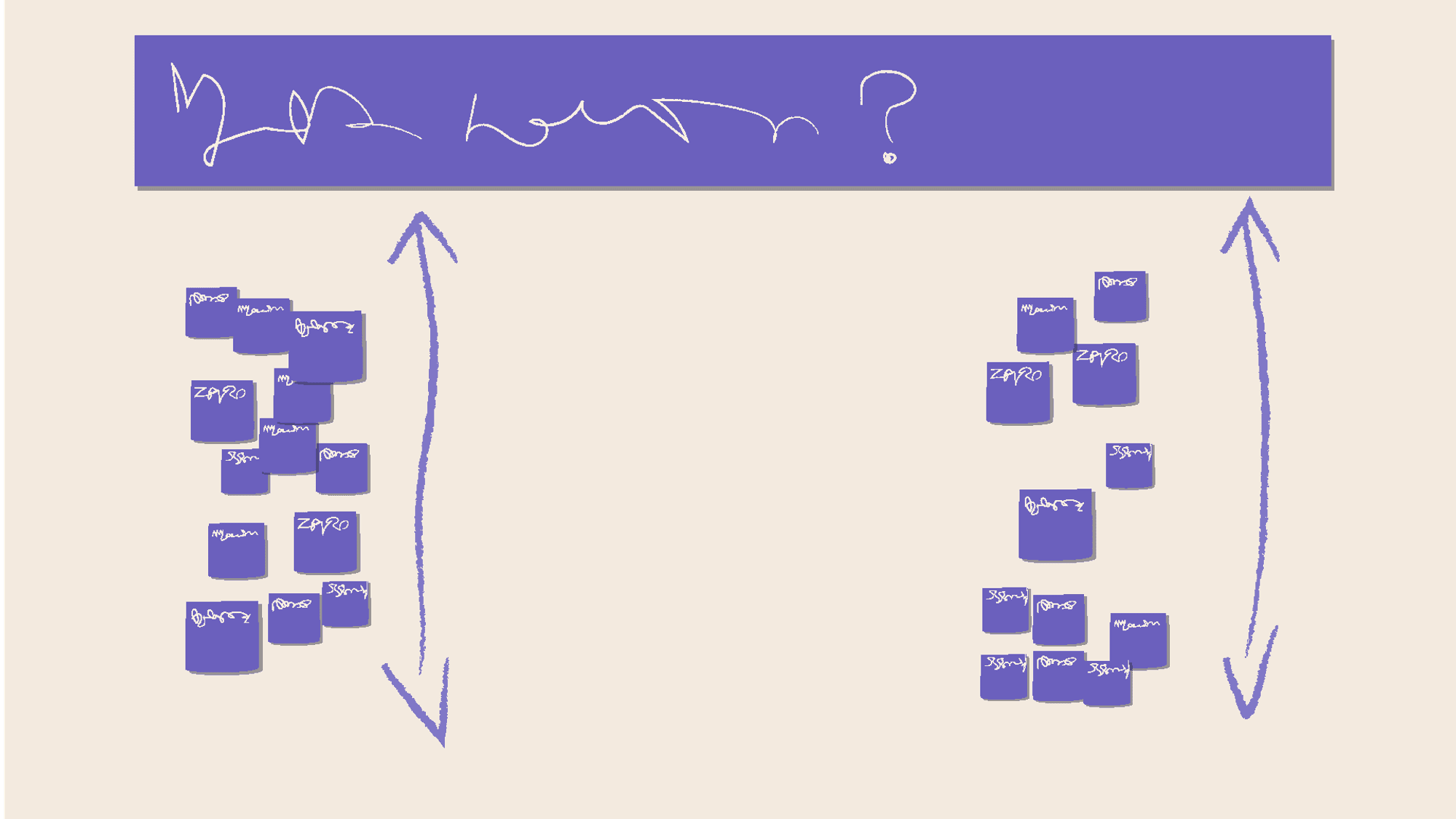
Based on the answers and trends from previous assignement, we designed a workshop which I helped facilitate. During the workshop we had the client rank the what they view are the most important functions and features of their product
After this, we proceeded with an excercies in value, where they were asked to separate each funtion according to business value and user value. The purpose of this excercies was to align in the features that can bring the most value overall.
During the workshop we also tasked the client to think about how their relation to their competitors are
Key findings after the workshop were:
The client is behind the competition in some areas, and are well aware of that.
Many exciting opportunities in the future, some which they can position themselves as market leaders withing
Challenges
The product is a legacy system which has recieved odd updates with several features and changes being added by request of specific customers, which can often impact other users of the system.
The company has been purchasing smaller competitor and absorbed their legacy products into a bigger system
There are many instances of “putting out small fires”, where they turn into other problmes.
UX Review
User Personas
We were supplied with pre-existing personas by the client which were divided into two segments, four user personas and one buyer persona. During our work we focused on the four user personas, as the buyer persona will seldom (if ever) interact with the product.
These personas served as a guide for finding user to interview later on in the project.
System/product investigation
We were given access to a test account and were able to experience the product from the point of an end user.
During the system investigation, I drew up a sitemap and mapped out the user flows in order to get an overview of how users are working within the system. The key takeaway from the sitemap was that even though the system is not ostensibly complex, due to the design of the user flows it feels a lot more complex than it actually is. Hypothesis that this is confusing to be added here
Another key discovery is that the system was divided into two functionally and visually distinct parts, which altered the user interface drastically and removed several options for the users, leading to a sense of confusion. A novel approach, but how are the users liking it?
Heuristic Evaluation
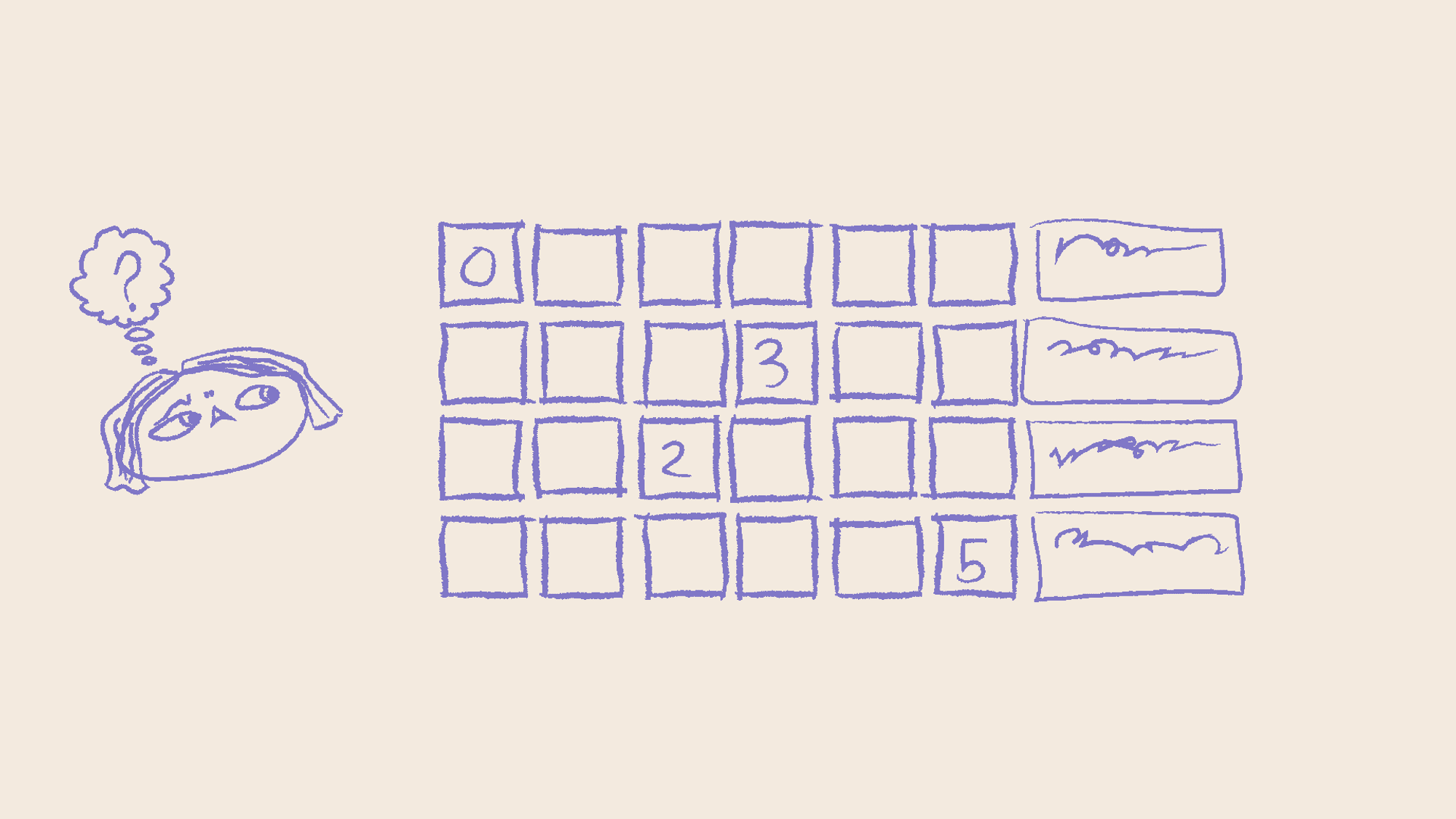
Based on the findings of the system/product investigation, I initated a heuristic analysis. I answered a total of 107 questions over ten different heuristics, and then scored each category based on the results.
The results per heuristic were as follows:
Visibility of system status - 14 / 25
Match between system and the real world - 80 / 140
User control and freedom - 11 / 25
Consistency and Standards - 50 / 90
Error Prevention - 30 / 55
Recognition rather than recall - 14 / 25
Flexibility and efficiency of use - 80 / 140
Aesthetic and minimalist design - 47 / 100
Help users recognize, diagnose, and recover from errors - 9/30 - Critical
Help and documentation - 15 / 30
Key findings
Error prevention had been given almost no thought, in several instances errors were just displayed in a toast containging the words “something has gone wrong”. Users could not know what to do after recieving an error.
Overall design hierarchy was confusing, there were several instances of buttons that did not look like buttons, and no-buttons that looked like buttons.
Visual coherency was low - the previous designers and developers had started out by using Google’s Material Design, but strayed from it in different ways - which resulted in a quite messy overall look and feel
Competitor Analysis
We performed a competitor analysis based on a number of other actors in the digital signage business, both locally and around europe. We were not able to acess any systems during the anlysis, which was not surprising considering the nature of the business. We were able to corroborate our findings both through our workshop with the client, and also during our presentation of the UX Review.
What became apparent during the analysis is that the client is falling behind on their product packaging, and many competitors have a much more coherent and straight forward presentation of their services and product USPs.
User Interviews and testing
Based off of the personas supplied from the client, and using their customer network we were able to set up and perform five user interviews with different anchors in the supplied personas.
I took part in designing the user interviews, and performed several of the interviews alongside my supervisor. The user interview sessions took about 45 minutes to an hour each.
Key takeaways from the interviews:
Error messages are not up to standard, even power users are not able to interpret or understand the majority of error messages, sometimes not even the clients own helpdesk were able to solver users problems.
We also asked the users on how they use and interact with the dashboard section of the product. It turns out that none of the users ever used it, the reasons they stated was that they percieved it to not provide any utility or helped them perform tasks.
The file system does not behave as expected - this turned out to be a major timesink for many users who work with uploading new material into the product.
Even though many users had their fair share of criticisms, all of our users that participated in the interviews said that desipite flaws, the system is much better than the old way of using USB sticks to display the content.
We also performed a small user test at the end of the interview session, where we asked the user to perform a daily task while we observed.
Way Forward
After the UX Review was completed, we delivered a 70+ page report to the client and briefed them through our findings, and our suggested way of moving forward. The first steps in the way forward were as follows:
Set up a design system
For a coherent application design, setting up principles and design system will help with a lot of the issues found today in the user experience.
Oversee & optimise usage flows
By optimising usage flows with established usability conventions we enable that users can understand what is expected to be accomplished in any given situation in the product.
Remove complexity
Going from complexity to a intuitive UI is hard but worth the effort for the user experience. By simplifying and reducing complexity in the UI, the product will become easier to understand and work in.
Core Functions
By giving focus to improve the core functions in the product such as scheduling, players management and playlists the overall user experience of working in the product can be strengthened.
Preview the work!
Letting the Engage users easily preview Players to see the work before publishing removes frustration and gives the users a sense of control in their workflow.
Key Learnings & Challenges
During this project I learned how much a properly set up and maintained design system can help users in their day to day tasks. I saw through the heuristic evaluation and user interviews how much impact a thoughtful design system could do for the users.
The product we reviewed was the result of many years of aquisitions, and there had been several versionf of the products before we got to take a look at it. This product could in a way be described as a “frankenstein product”, where bits and parts of several older products have been assembled into a completely new product.
A lot of features I came across when testing the product for myself, and after the user interviews have been the result of users directly asking the client to implement them, without any user tests being done beforehand. This has resulted in many confusings options that are available for every user of the product, while only serving a use for a single user cas
Contact
Get in touch with me at: